

Never underestimate the power of color in marketing. Brightly colored print materials can make the difference between a sale and just another lead. From RBG to Pantone, colors play a key role in branding, allowing you to build a more personal connection with customers.
Print marketing color importance can’t be overstated; choose your colors carefully to fit the structure of your project. Knowing the difference between ink types is an important part of choosing colors that have the right effect on your audience. Below, we provide an overview of the important differences between RGB, CMYK, and Pantone to give you a better understanding of these essential ink types.
Understanding the RGB Color Model: Digital Color Representation

The RGB color model is one of the most important and recognizable systems for measuring and describing color in digital marketing. This prominent method is based on the three primary colors, which form all other colors: red, green, and blue. Most digital images — including those on your computer screen, smartphone, and digital camera — are produced using these primary colors.
The RGB model is a light additive color model. This means that colors are added together to create lighter colors. When you combine red, green, and blue in equal amounts, the end result is absolute white. However, combining different combinations (such as just two colors in varying amounts) will result in other colors. For example, combinations of red and green produce yellow, while red and blue create magenta. Meanwhile, yellow, green, and blue make cyan. Essentially, RGB colors can be used to create CMYK colors for printing purposes. To enable RGB color for printing, these files must be converted.

Why is CMYK Preferred for Print?

CMYK stands for the four ink colors that are applied during the printing process: cyan, magenta, yellow, and key (better known as black). As mentioned earlier, these colors are produced by combining various RGB hues. The term ‘key’ was originally used instead of black because the CMY plates in four-color printing are ‘keyed’ (aligned) with the black plate’s key.
One of the primary differences between CMYK and RGB: CMYK colors are subtractive. To obtain lighter colors, ink must be removed. For example, red can be subtracted from white light to create cyan.
Additive and subtractive methods are notoriously easy to confuse especially when converting CMYK to RGB colors or vice versa. One way to think of these two processes: black reflects an absence of light with RGB, but a full combination of colors with CMYK. With CMYK, white actually involves an absence of colors, as it is the natural color of the paper or another form of background.
Another important difference between RGB and CMYK: RGB is primarily used for digital purposes, while CMYK is applied to printing. Most at-home printers, high-end color laser printers, and industrial offset presses use CMYK ink colors. During the printing process, the printer uses mixtures of all four colors (cyan, magenta, yellow, and black) while printing different colors.
Halftoning and CMYK Color For Printing

An important concept to understand when delving into CMYK printing is halftoning. Sometimes referred to as ‘screening,’ this technique is used to reduce saturation for primary colors. Depending on how the colors are printed, the human eye may perceive a solid color. For example, halftoning with magenta can produce a convincing pink, as small magenta dots spaced sufficiently apart on white paper appear considerably lighter.
Halftoning is responsible for the vast array of color combinations made possible through the CMYK method. Without half-toning, only seven colors could realistically be produced. These would include the three primary colors, as well as secondary colors produced via layering of primary colors. Finally, all three primary colors could be layered to create the seventh full CMYK color: black.
Pantone® Colors: The Gold Standard in Precise Color Matching
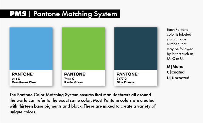
Pantone color is a standardized system that revolutionized print marketing colors. The Pantone Color Matching System ensures that manufacturers all around the world can refer to the exact same color and feel confident in their matching ability, despite never coming into direct contact with one another. Currently, Pantone boasts a total of over 1,800 different colors.
CMYK can play a role in Pantone (PMS) colors. A specific subset of Pantone colors are actually reproduced using CMYK. Specific CMYK to Pantone guidelines highlight exactly which colors can be reproduced via cyan, magenta, yellow, and black inks. The majority of Pantone’s colors, however, are not created via CMYK, but rather, with thirteen base pigments (as well as black). These are carefully mixed to create a variety of unique colors for Pantone printing.
Each Pantone color is labeled via a unique number. For example, PMS 191 refers to a specific shade of pink. Pantone numbers may be followed by letters such as M, C or U. These stand for matte, coated, or uncoated.
Pantone’s primary advantage is that it makes it easy to avoid color inconsistencies in both print and digital media. Although largely used in marketing, Pantone color identification has proven useful across a surprising array of industries, including fashion, beauty, and real estate, among others.
Navigating the Challenges of Color Representation
It is important to consider the difference between the aforementioned color models when creating designs. Colors will appear completely different on your computer monitor than they will on printed material. In addition, no two display screens will show colors completely the same. This makes the design and printing process a bit more complex when it comes to choosing colors.

Graphic designers will typically use Pantone colors as a reference point because the colors on the computer screen are not identical to those on the printed page. They will then convert the Pantone shades to either RGB or CMYK, depending on whether the design will be in a digital format, such as a web page, or a printed format such as mailers or printed ads.
If the print project at hand requires colors that are an exact match, Pantone colors will be used and processed as a fifth color on the printing press. However, it is important to note that this will raise the cost of the printing project. Retaining Pantone colors during printing requires extra plates as well as additional time and effort in setting up and washing up. Companies should consider the potential for an additional cost along with their printing budget before deciding on an identical color match for print projects.
Now that you know a little bit more about the different ink types and how they can affect the printing process, you can make more informed decisions about your print collateral design. Ultimately, your goal should be to select colors that deliver the greatest marketing ROI for print and digital formats.
What You Need to Know: Essential Insights on Color Models
- RGB is an additive color model primarily used for digital formats.
- CMYK is a subtractive model mainly used in print materials.
- Pantone provides a standardized system for color identification and matching.
- Pantone shades can be converted to RGB or CMYK.
Contact Ballantine for Print or Digital Marketing Support
If you need help choosing the right ink colors or creating print or digital designs that evoke the right emotions, our team is ready to help. The marketing experts at Ballantine can take care of your design and print work so that you don’t have to worry about everything looking great. Call us today for more information: (973) 928-7271.
*This post above was updated. Below you can see the original post from 2017.*
CMYK, RGB And Pantone For Print Marketing
Using the right colors in your print collateral is a vital part of creating valuable marketing materials that connect with your audience and work to build a connection. It is important to choose your colors carefully to fit the structure of your project. Knowing the difference between ink types is an important part of choosing colors that have the right effect on your audience. Below, we will provide an overview of the important differences between RGB, CMYK, and Pantone to give you a better understanding of these different ink types.
The RGB Color Model
RGB stands for Red, Green, and Blue. Most digital images are produced using these primary colors, such as those on your computer screen or digital camera. The RGB color model is a light additive color model. This means that colors are added together to create lighter colors. When you combine 100% red, green, and blue, you will get an absolute white. However, combining different combinations will result in other colors. For instance, when red and green are added together, you get yellow. Red and blue produce magenta, and green and blue make cyan.
The CMYK Color Model
CMYK stands for the four ink colors that are applied during the printing process: Cyan, Magenta, Yellow, and Black. The CMYK color model is subtractive, which means that in order to get lighter colors, the ink needs to be removed. Most at-home printers, high end color laser printers, and industrial offset presses use CMYK ink colors. During the printing process, the printer will use mixtures of all four colors (Cyan, Magenta, Yellow, and Black) while printing different colors.
The Pantone® Matching System Color Model
Pantone (PMS) colors are associated with a color matching system. Conventional printers use the Pantone Matching System to recreate colors and artwork by creating inks in distinct shades. Some colors are difficult to produce during the printing process. For example, some shades of orange and green can be time consuming to reproduce. The Pantone Matching System makes for a consistent color match.
Important Considerations for Ink Types
It is important to consider the difference between these color models when creating designs. Colors will appear completely different on your computer monitor than they will on printed material. In addition, no two display screens will show colors completely the same. This makes the design and printing processes a bit more complex when it comes to choosing colors.
Graphic designers will typically use Pantone colors as a reference point because the colors on the computer screen are not identical to those on the printed page. Then they will convert the Pantone shades to either RGB or CMYK, depending on whether the design will be in a digital format, such as a webpage, or a printed format like mailers or printed ads.
If the print project requires colors that are an exact match, then Pantone colors will be used and processed as a fifth color on the printing press. However, it is important to note that this will raise the costs of the printing project. Retaining Pantone colors during printing requires extra plates as well as additional time and effort in setting up and washing up. Companies should consider the additional costs along with their printing budget before deciding on an identical color match for their print projects.
Now that you know a little bit more about the different ink types and how they can affect the printing process, you can make more informed decisions about your print collateral design.
Contact Ballantine for Print Marketing Support
If you need help choosing the right ink colors or creating printing designs that evoke the right emotions, our team is ready to help. The marketing experts at Ballantine can take care of the design and print work for you so that you don’t have to worry about everything looking great. Call us today for more information: (973) 928-7271.
I'm the Director of Digital Services and Partner at Ballantine, a family-owned and operated direct mail & digital marketing company based in New Jersey. and started in 1966 by my great uncle!


![Direct Mail Marketing Campaign Mistakes To Avoid [Infographic]](https://www.ballantine.com/wp-content/uploads/2018/01/1200X628Ballantine_1.png "Direct Mail Marketing Campaign Mistakes To Avoid [Infographic]")
![How to Create Impactful Holiday Direct Mail [Infographic]](https://www.ballantine.com/wp-content/uploads/2017/11/1200X628Ballantine_2-3.png "How to Create Impactful Holiday Direct Mail [Infographic] UPDATED")