

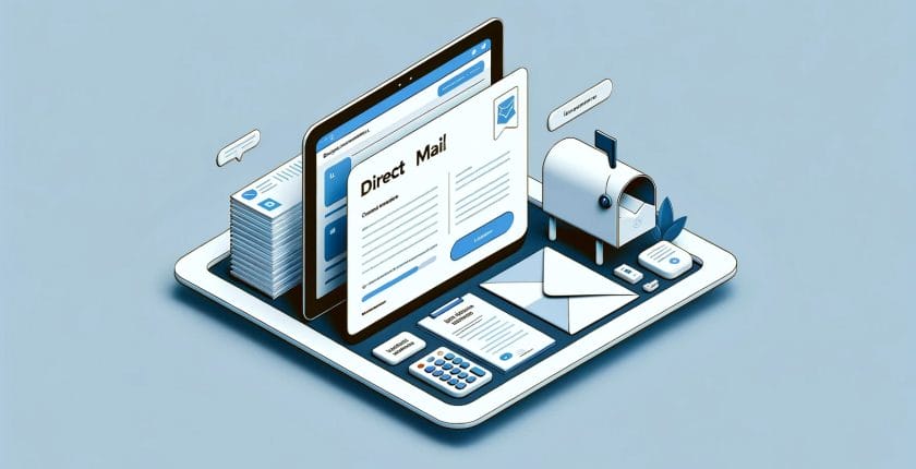
The marketing landscape in 2024 continues to evolve at an unprecedented pace, with direct mail marketing carving out new paths for business owners to connect with their audiences. This year, we’re looking forward to seeing some exciting developments in how direct mail is used, blending tradition with innovation for impactful marketing strategies. Let’s dive into […]

Unlocking the Power of Direct Mail: Budget-Friendly Strategies for Insurance Companies
Embarking on a mail campaign, particularly for insurance companies, requires not just creativity but also a strategic approach to budgeting. Keeping costs in check while maximizing the impact on your target audience can seem like walking a tightrope, but it doesn’t have to be. Here are some budgeting tips that can help insurance business owners […]
The Direct Path to Growth: Leveraging Mail Campaigns in Insurance
In an age where digital noise is omnipresent, the charm and impact of direct mail in the insurance industry are experiencing a resurgence. Understanding how to leverage this tool can transform your marketing strategy, leading to more significant lead generation and return on investment. Let’s dive into the potent mix of direct mail and insurance […]

Harnessing the Power of QR Codes in Your Direct Mail Campaign
In today’s dynamic landscape of direct and digital marketing, it’s essential for business owners to stay ahead of the game. Finding efficient and cost-effective ways to enhance your marketing strategy is the key to success. This is where the integration of QR codes into your mail campaigns comes into play. It’s a simple yet powerful […]

Direct Mail in 2024: Here’s Why It’s Still a Winning Strategy
It’s almost 2024, and while the digital realm might seem to be the focal point for marketers, there’s an old hero that’s far from forgotten: Direct Mail. You read that right. In an era of social media influencers and digital campaigns, it’s the postal service that’s delivering impressive results for businesses. Let’s dive deep into […]

The Business of Staying Top-of-Mind: Perfecting Your Direct Mail Frequency
As a business owner, navigating the complexities of marketing can be challenging. Yet, amidst the plethora of digital strategies, there lies the often-underestimated potential of direct mail. Ensuring the right frequency and timing of your direct mail campaigns is paramount. Let’s delve deep to fine-tune your approach. Clarify Your Business Goals Every successful marketing endeavor […]
The Power of Print Media and Navigating USPS Price Changes in 2024
In today’s digital age, there’s something wonderfully personal about receiving physical mail. In fact, 75% of recipients treasure that feeling of specialness when they find a well-designed piece of print media from their favorite brand in their mailbox. USPS marketing mail offers businesses an exciting avenue to connect with their audiences in this tactile manner. […]

Stand Out with These Highly Personalized ABM Direct Mail Ideas
Account-based marketing (ABM) is a highly targeted approach that B2B marketers use to engage with specific accounts and decision makers. In this blog, we will explore some ABM direct mail ideas that can help you stand out from the competition and increase your response rates. Mail Strategy ABM direct mail requires a highly personalized approach. […]

Direct Mail Unleashed: Your Secret Weapon for Customer Retention
Imagine elevating your customer retention rates to a whole new level, all with the power of direct mail! This engaging read dives into how you can fuse this classic marketing strategy with modern insights to not just retain your existing customers but transform them into a tribe of loyal followers. Get ready to redefine customer […]

Direct Mail in the Digital Era: A Modern Twist on Traditional Marketing
Steeped in tradition yet agile in adaptation, the direct mail industry is proving that it’s more than just a relic of the past. It’s an industry that’s dynamically evolving, redefining its strategies and capabilities to fit snugly within the ever-changing landscape of the digital age. The transformation is captivating—a blend of the tactile, personal appeal […]